Custom Orthodontist Branding for Sage Orthodontics
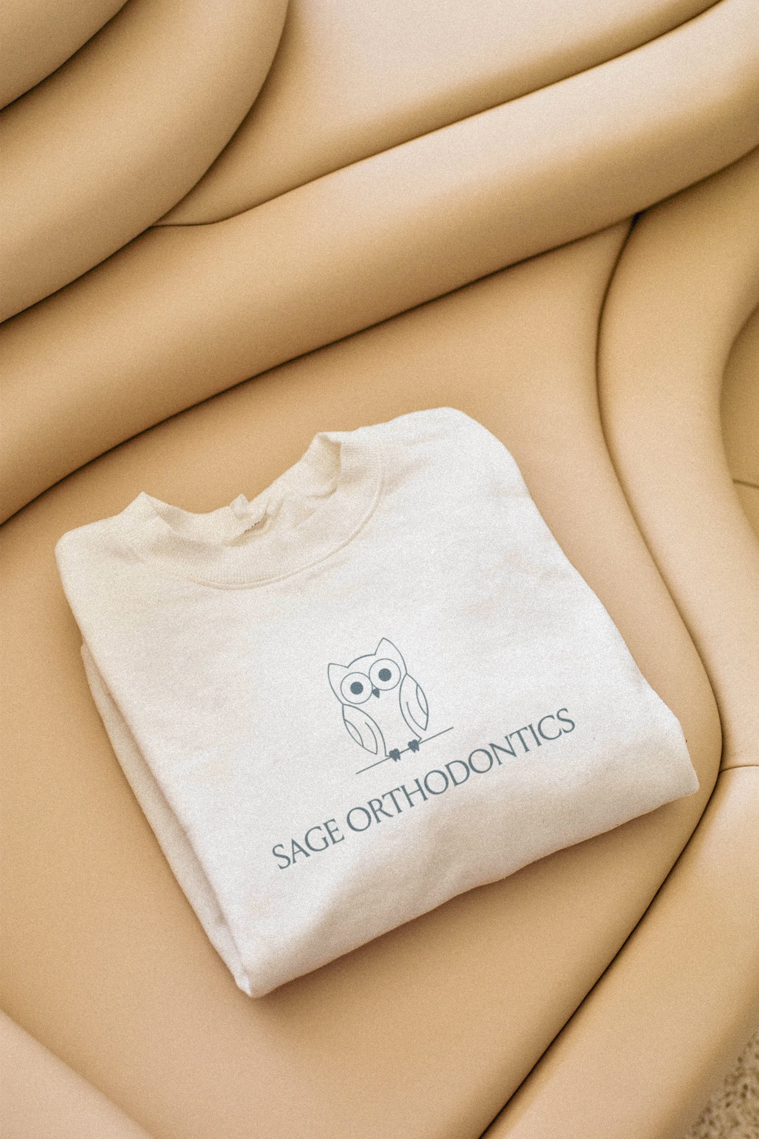
TLDR: We created custom orthodontist branding for Sage Orthodontics rooted in wisdom, clarity, and connection. The result is a thoughtful identity that feels professional without losing the practice's personality.
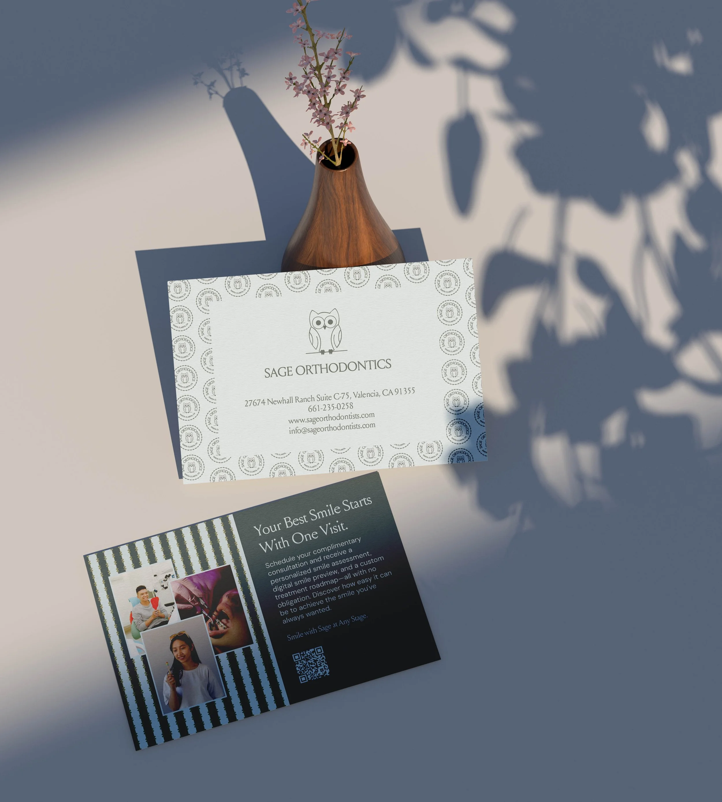
Sage Orthodontics is led by a husband-and-wife team providing orthodontic care to families, teens, and adults in the Valencia community. For them, great care goes beyond creating confident smiles. It’s also about building relationships, helping patients understand their care, and making sure they feel supported along the way.
When we worked with them on their branding, we wanted the identity to reflect that experience. Instead of simply making the practice look like an orthodontic office, we looked for the details that could tell people a little more about who Sage Orthodontics is.
Finding the Direction for Sage Orthodontics
In an industry where teeth, smiles, and braces are understandably everywhere, we wanted Sage Orthodontics to have a visual identity that felt connected to their specialty without blending into the crowd.
A few ideas became the foundation for the brand:
Wisdom: The name Sage was inspired by the sage plant, which is native to the area, but the word also carries another fitting meaning: wisdom. That idea felt especially fitting for a practice centered on expertise, education, and helping patients make informed decisions about their care.
Clarity: Straight teeth may be one outcome of orthodontic treatment, but patients and families also want to understand what’s happening along the way. We wanted the brand to reflect an experience where people feel informed and confident in the decisions they’re making.
Connection: Orthodontic care can last months or even years, so the relationship between the practice, patient, and family matters. The brand needed to feel knowledgeable without becoming overly clinical or distant.
These ideas gave us a clear starting point and plenty of opportunities to create something that felt distinctly theirs.
Translating What Sets Them Apart Into Orthodontist Branding
With the direction in place, we could start translating it visually. From the primary symbol to the color palette, each part was designed to support the brand’s goals.
A “Wise” Primary Brand Symbol
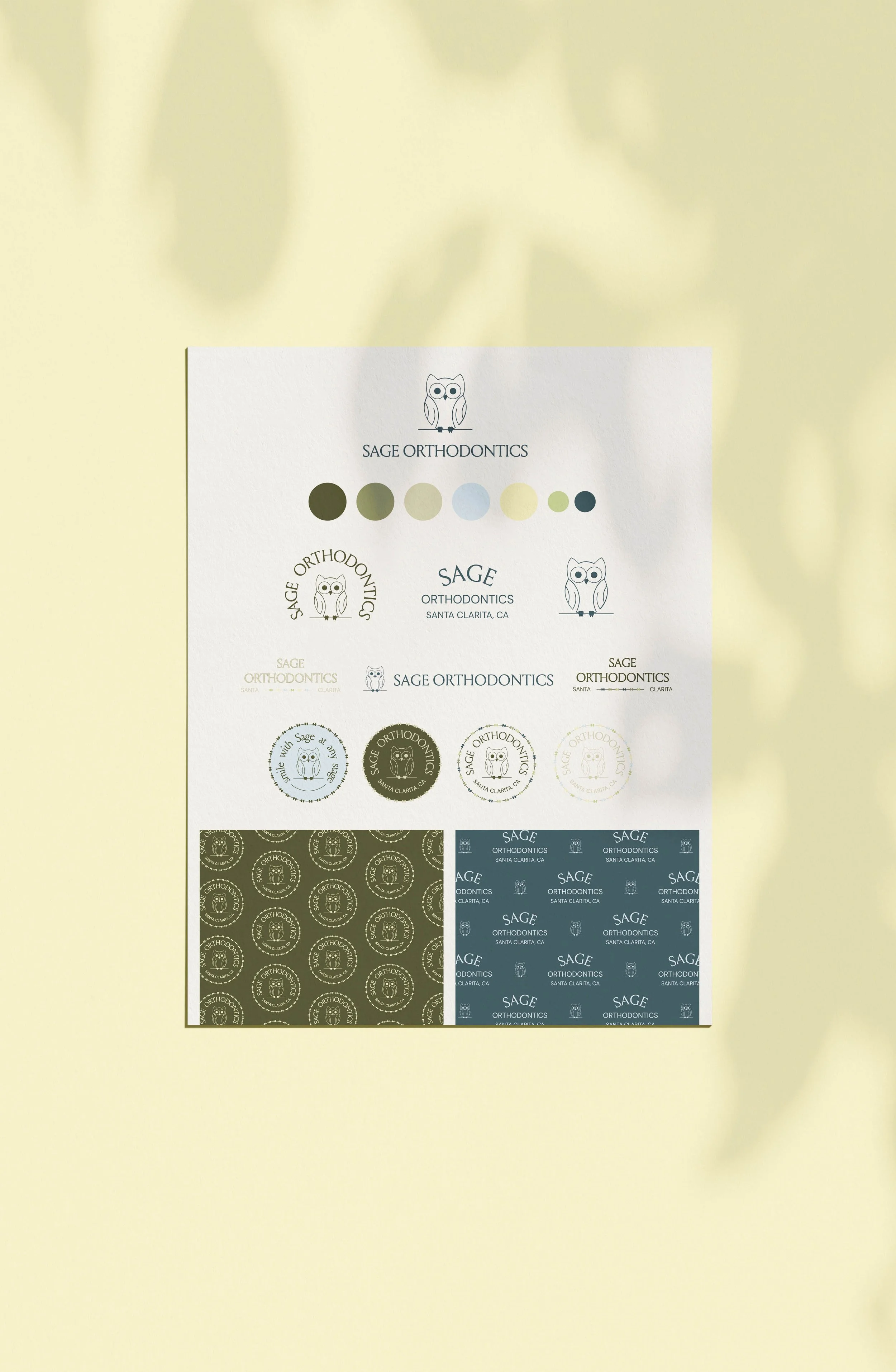
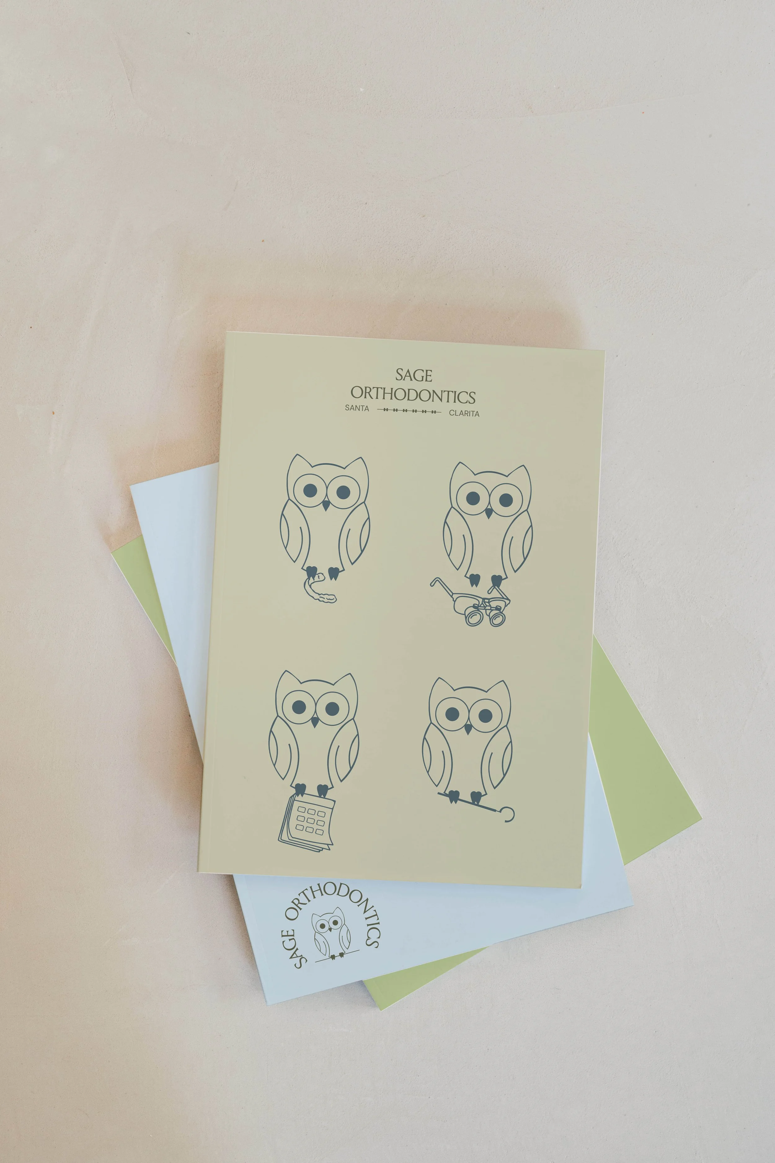
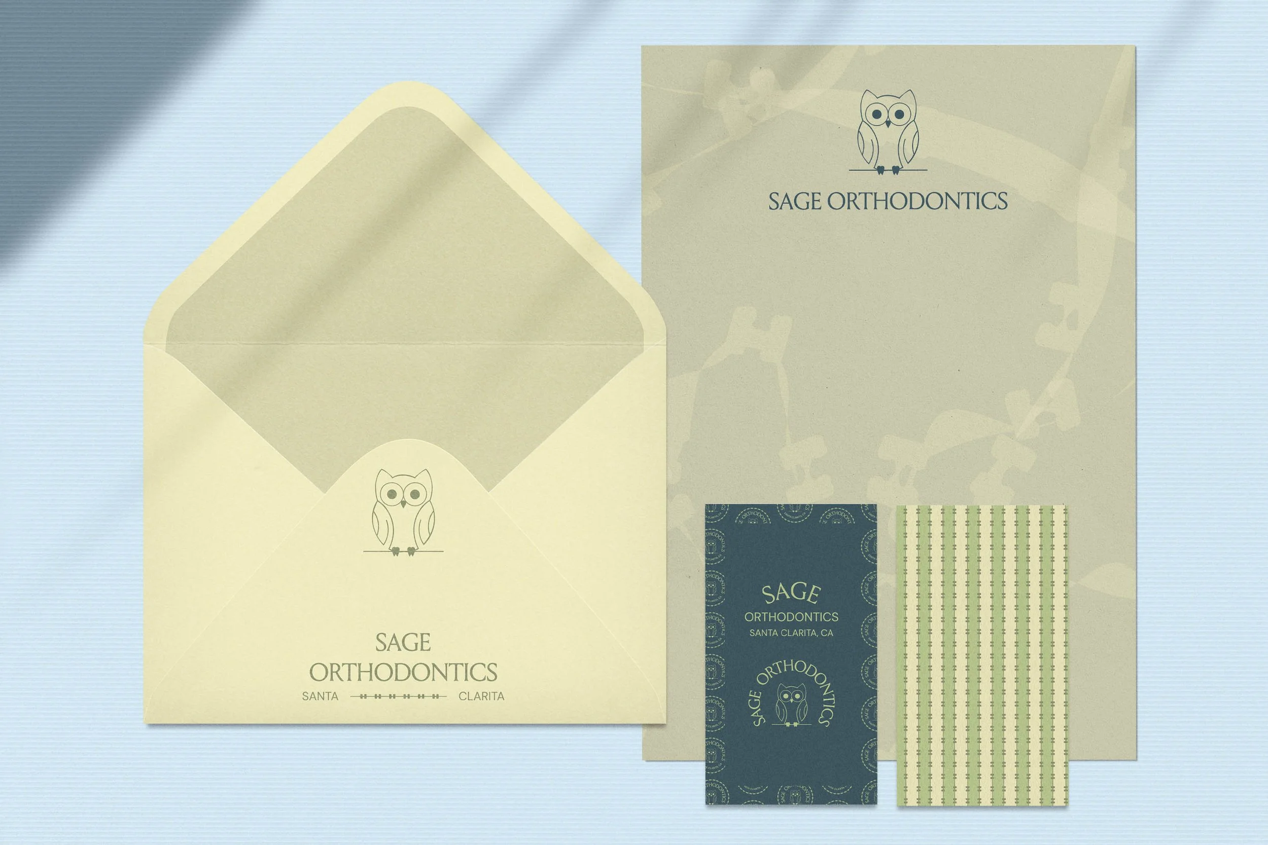
We designed a minimalist owl perched on an orthodontic wire, a fitting symbol of wisdom that connects naturally to the Sage name and the expertise behind the practice. Look closely, and you’ll notice its tiny feet resemble teeth (a little detail we had fun sneaking in), adding an orthodontic connection without making the symbol too obvious.
Thoughtful Logo Variations
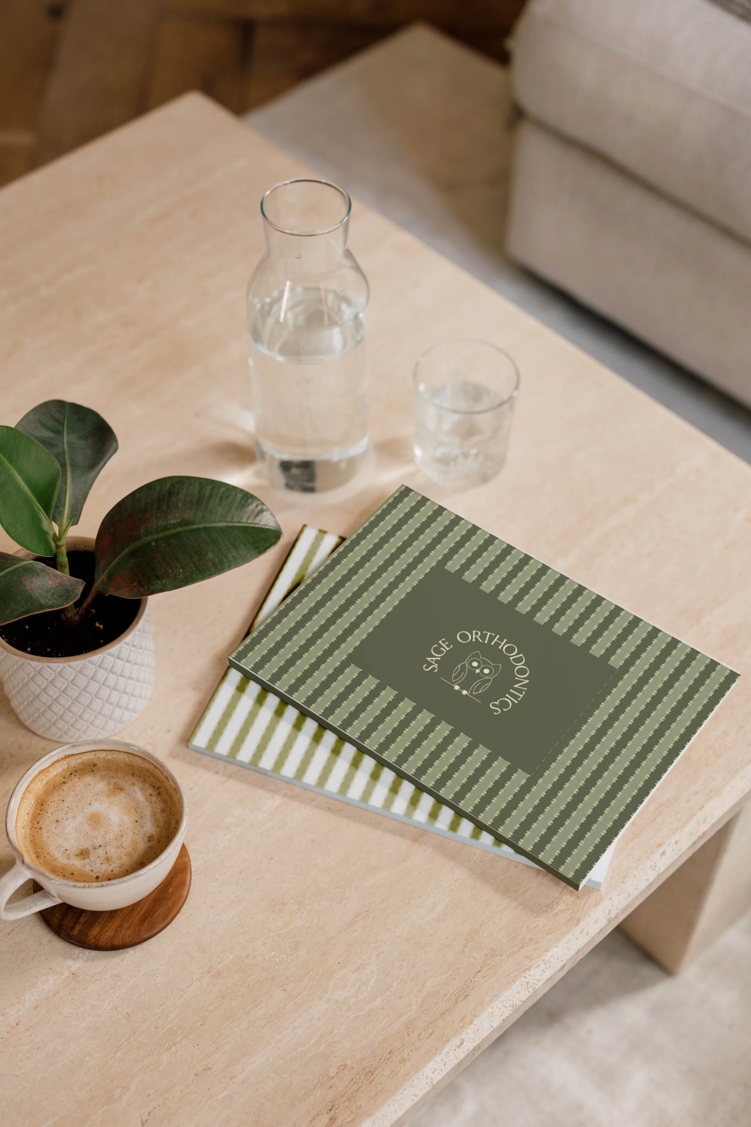
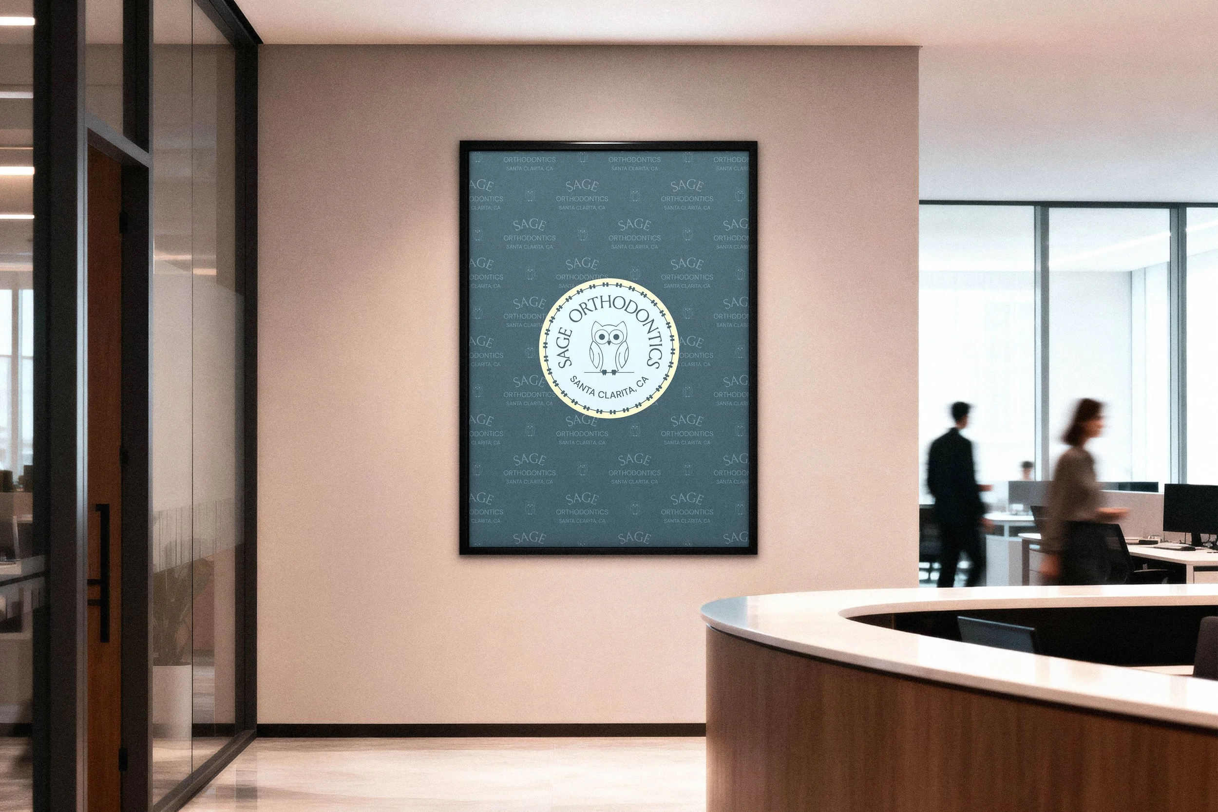
Select logo variations incorporate orthodontic brackets as decorative elements, giving the specialty a place within the identity without relying on the typical tooth or smile. These variations help keep the logo system connected to what Sage Orthodontics does while still giving the practice a look of its own.
A Calm, Approachable Palette
Soft sage greens connect naturally to the practice name, calming blues bring in a sense of trust, and warm cream tones soften the overall palette. Together, the colors feel professional without becoming too clinical, which works well for a practice welcoming parents, teens, and adults.
More Room for Personality
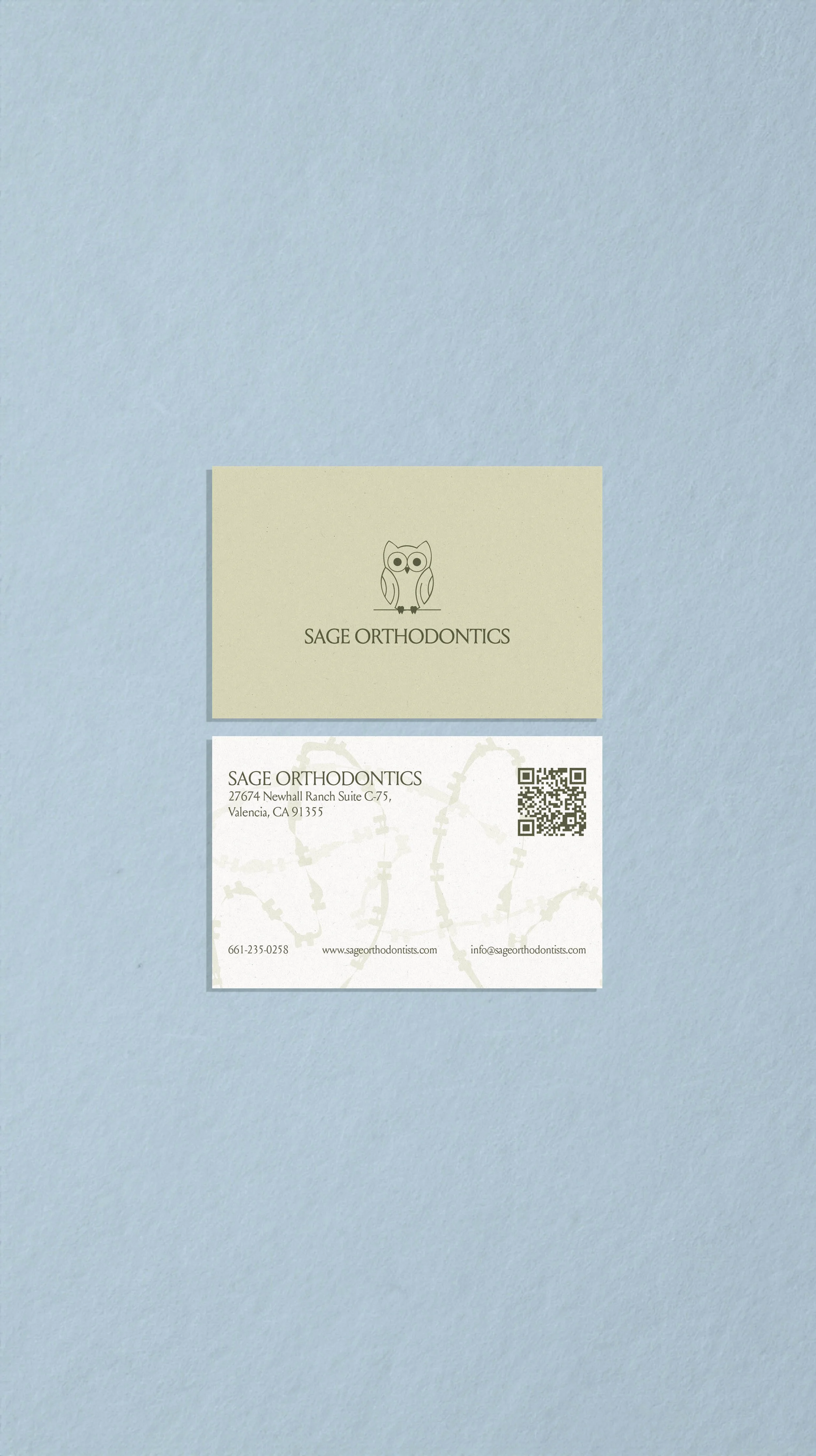
Flowing bracket patterns bring movement to the visual identity, while playful owl illustrations give Sage more ways to have fun with the brand. Together, these supporting elements make it easier to carry the identity into social media, print materials, and other applications without putting the logo front and center every time.
Bringing It All Together
Now for the fun part: seeing how everything came together for Sage Orthodontics.
Stand Out With the Details That Matter
In a field where businesses naturally offer similar services, standing out doesn’t always mean doing something wildly unexpected. Sometimes it comes from finding the ideas, personality, and perspective that already belong to your business and turning them into details that feel authentic to you.
That’s one of our favorite parts of custom branding at Saltd Studio. We get to dig around for those little ideas that make us think, okay, there’s something here, and find creative ways to bring them into the brand. If you’re curious what that could look like for your own business, explore more of our branding projects or send us a message. We’d love to hear what makes your business yours and see where we can take it.
Key Takeaways
Strong orthodontist branding can communicate more than the services a practice provides.
Sage Orthodontics’ identity began with ideas already meaningful to the business.
A flexible brand system creates more opportunities to show personality across different touchpoints.
Looking beyond the obvious industry imagery can open up more distinctive design directions.
Small, intentional choices can help a practice create a more recognizable identity.