How Many Colors Should Be In A Brand Color Palette?
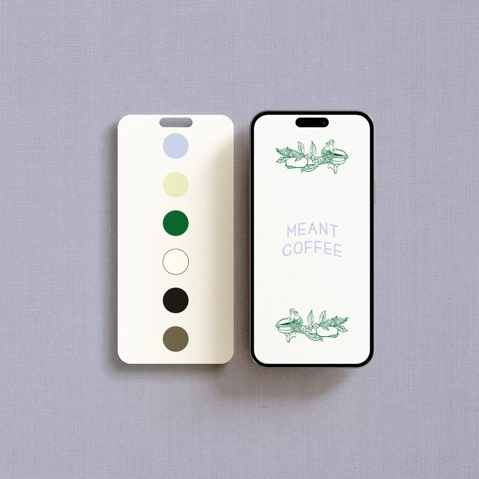
TLDR: In our work creating brands for businesses and private healthcare practices, we’ve found that a brand color palette works best with 4 to 6 colors, plus black and white. This gives you enough range to design freely while still keeping everything consistent and recognizable.
Why Color Matters More Than You Think
Color is one of the most defining parts of your brand. It is often what people remember first and what they come to associate with your business over time. Think about it: if you close your eyes and imagine Walmart, the blue and yellow are likely what you see first, along with their brand symbol. Same with Target’s red, McDonald’s yellow, Starbucks’ green, and so on. Research shows that color can increase brand recognition by up to 80%.
But beyond recognition, color shapes how your brand feels before someone reads a single word.
This becomes especially important for private healthcare practices. Look at ten dentists, optometrists, chiropractors, dermatologists, or med spas in the same area, and there’s a good chance several of them look surprisingly similar. Your brand shouldn’t make your practice feel interchangeable with every other office nearby. Your color palette is one piece of creating a distinctive identity that people can recognize and remember.
So when you start choosing your brand colors, it can feel like a lot. Should it be minimal? Should it be expressive? How many is too many?
Through our work creating brands for businesses and private healthcare practices, we’ve guided many owners through this exact decision. It may seem like a small detail, but it carries more weight than most people expect.
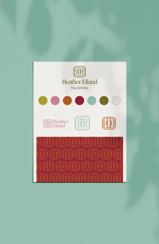
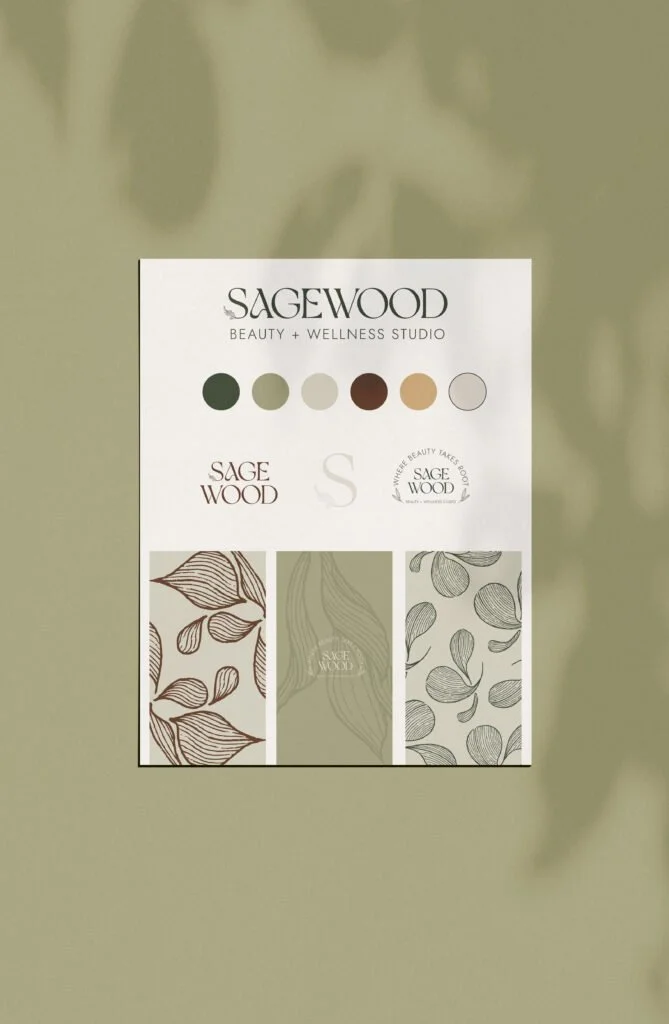

Quick Guide on Choosing Colors for Your Business
Here are a few things we usually walk our clients through.
1. Start with 4 to 6 core colors
This is where most brands feel balanced. It gives you enough variation to design across different touchpoints, from your website and social media to signage and patient materials, without your visuals feeling repetitive.
At the same time, it keeps your brand grounded. When there are too many colors, the brand can start to feel unclear. When there are too few, it can feel limiting as your business grows.
2. Always include black and white
Black and white are part of your palette, not just placeholders. They support readability, contrast, and structure. You will use them across almost everything you create, whether that is your website, printed materials, social media, or everyday documents.
3. Use tints and shades for flexibility
You do not always need more colors. You often just need more range. Lighter and darker versions of your core colors allow you to create depth and hierarchy while still keeping everything cohesive. This is usually where a palette starts to feel more refined.
But shaping a palette to truly reflect your practice takes more intention than simply choosing colors you like. At Saltd Studio, we consider your audience, positioning, personality, competitors, and the experience you want someone to have when they encounter your brand.
Using Color to Strengthen Your Brand
A well-designed palette is not just about what looks good. It is about what feels right, differentiates your business, and works over time. Brands that are done well are set up for success with:
A palette grounded in brand strategy
Hot take: your colors should come from how you want your brand to be perceived by your target audience, not just what is popular right now or your personal favorite colors.
For a healthcare practice, this doesn't mean automatically choosing the same blue, green, white, or muted neutrals as everyone else in your specialty. Look at what competing practices are doing, then consider how your brand can feel distinctive while still making sense for the patients you want to attract.
The goal is to become recognizable and memorable to the right people. Trends can be helpful for inspiration, but they move quickly. Your brand should feel steady long-term.
Enough contrast to be usable and accessible
Your colors need to work in real life. That means your text is readable, your visuals are clear, and your website can be used by as many people as possible.
If you want your design to meet WCAG Level AA contrast guidelines, normal text should have a contrast ratio of at least 4.5:1 against its background. Large text should have a contrast ratio of at least 3:1. Large text is generally defined as at least 18pt, or 14pt if bold.
This is especially important when you're designing a healthcare website. A beautiful color combination isn't very useful if patients struggle to read appointment information, learn about your services, or navigate your website.
It also means that not every color in your palette needs to work in every combination. Part of building a useful brand system is knowing which colors can safely be paired for text and backgrounds.
Flexibility without losing identity
Your palette should give you room to create across different formats while still feeling consistent. It should work whether someone encounters your practice on your website, Google Business Profile, social media, signage, printed patient materials, or an ad.
You shouldn't have to reinvent your colors every time you design something new or the seasons change. It's important to know who your brand is and stay true to that while leaving room to be playful here and there.
A clear brand guide to hold everything together
Having your color codes and usage guidelines documented makes a big difference. It allows anyone working with your brand, whether that is an employee, marketing partner, sign company, printer, or other vendor, to apply your colors consistently.
Over time, that consistency is what helps build recognition.
Frequently Asked Questions
What if I’m having a hard time deciding on my brand colors?
Start with how you want your brand to feel, not just how you want it to look. You can explore a few directions first instead of trying to land on one immediately. When you start applying those colors to real designs, it usually becomes clearer what fits and what does not.
What if I don’t like my brand colors after a while?
That happens more often than people expect. Sometimes a small adjustment is enough to bring your palette back into alignment. Other times, it is a sign that your brand has evolved and needs a deeper refresh.
What’s the difference between primary, secondary, and accent colors?
Primary colors are the ones most associated with your brand. Secondary colors support them and give you more flexibility. Accent colors are used more sparingly to draw attention to specific elements.
Should healthcare practices use blue or green in their branding?
Not necessarily. Those colors are common in healthcare, but choosing them simply because they feel "medical" can make it harder for your practice to stand out. We encourage dentists, optometrists, med spas, chiropractors, dermatologists, and other private practices to look at their competitive landscape and build a brand that feels distinctive rather than defaulting to what everyone else is doing.
Should I follow industry color trends or stand out?
It helps to understand what your industry typically looks like, but we don't recommend blending in just for the sake of fitting your category. Your brand should help someone distinguish your business from the other options they're considering.
Standing out doesn't mean being different just to be different. Your colors still need to make sense for your audience, positioning, and the experience you want your brand to communicate.
How do I know if my brand colors are accessible?
Contrast is one of the most important things to check. For WCAG Level AA, normal text should have at least a 4.5:1 contrast ratio, while large text should have at least a 3:1 ratio against its background.
Don't assume that two colors have enough contrast simply because they look different to you. Test the actual color values before deciding how they should be used across your website.
How do I avoid looking unprofessional with my colors?
Consistency plays a big role here. When your colors are used thoughtfully and repeated across your touchpoints, your brand naturally starts to feel more established. It is less about choosing "professional colors" and more about creating a thoughtful system for how you use them.



Approaching Colors with Confidence
At Saltd Studio, brand strategy is the foundation of everything we create. It guides every design decision, including color. For the private healthcare practices we work with, a big part of that is making sure your practice doesn't look interchangeable with every other office nearby.
We also believe your brand should feel personal to the people building it. You should love your business's design system. At the same time, we're designing it to connect with your patients. Sometimes those two perspectives align perfectly, and sometimes they need to be carefully balanced.
Color carries a lot of emotion. Our role is to balance strategy, differentiation, accessibility, and personality to create something that feels like your practice while still connecting with the people you want to reach.
If you're building or refreshing a private healthcare practice, our branding process can help you create a distinctive brand and website designed to help you stand out, build trust, and grow.
Key Takeaways
A balanced brand palette usually includes 4 to 6 colors plus black and white
Your colors should be grounded in brand strategy, not simply personal preference or trends
Healthcare practices don't have to use the same colors as everyone else in their specialty
Tints and shades give you flexibility without unnecessarily expanding your palette
For accessibility, aim for at least 4.5:1 contrast for normal text and 3:1 for large text
Consistent use of your colors is what builds recognition over time
Your palette should help your practice feel distinctive while still connecting with the patients you want to attract