
Michelle, the owner of VYVE Cycle Studio, isn’t new to the fitness world. After parting ways with a cycle franchise, she knew it was time to create something that truly reflected her vision through custom branding for a cycle studio, a space where women and men could feel stronger, more energized, and part of something bigger. Her goal was to build a welcoming, high-energy studio where riders could challenge themselves, move their bodies, and leave feeling better than when they arrived.
With courage and determination, Michelle took the leap to create VYVE, a brand that feels bold, dynamic, and always in motion. From the ground up, we worked alongside her to bring that vision to life, from creating a meaningful business name to crafting thoughtful messaging to designing a custom brand identity to launching a website that distinguishes her from franchises and every other cycle studio in Lubbock.

Stand Out with a Dynamic Brand Identity
VYVE Cycle Studio is more than a workout space. It is an energy, a rhythm, and a community you can feel the moment you walk in. To capture Michelle’s personality and vision for empowerment, we explored two creative directions and chose one that radiates boldness, power, and movement. This energy flows through every element of the brand, creating a visual identity that feels uplifting, welcoming, and full of life.
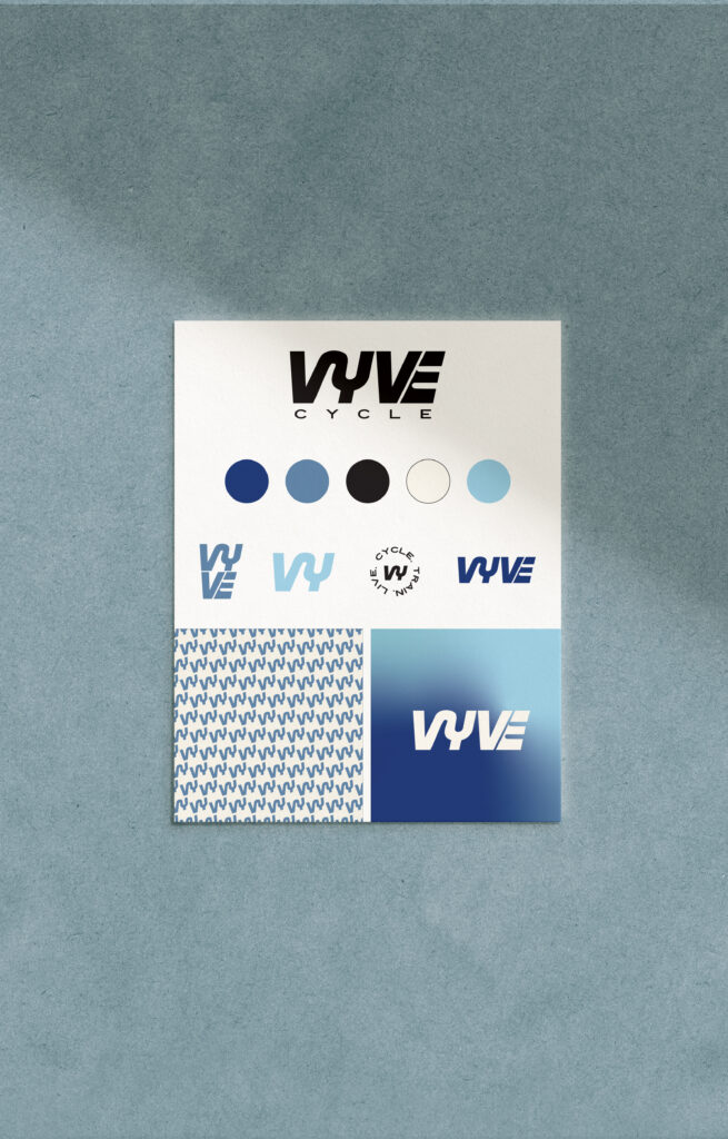
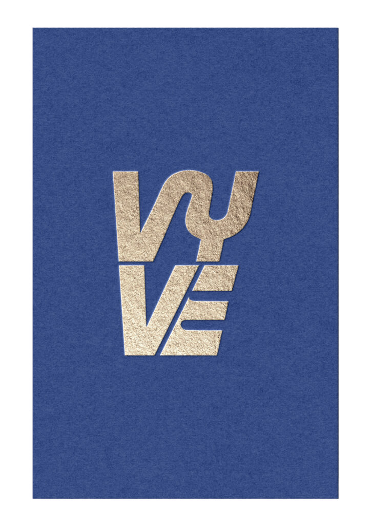
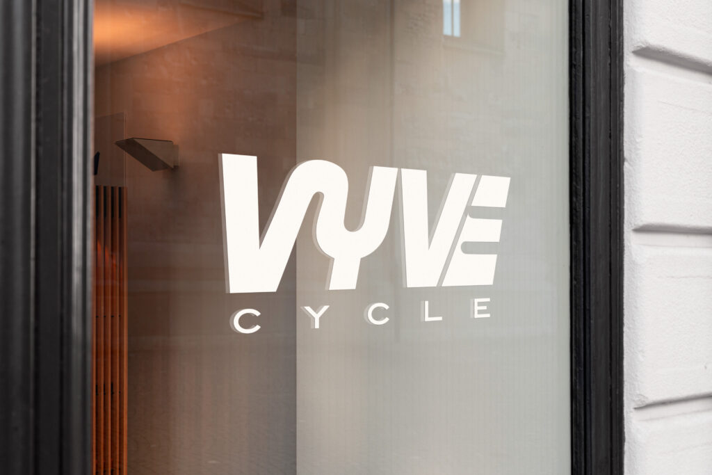
- A Logo in Motion – The bold, curved logotype represents alignment and togetherness. Its subtle slant gives a sense of motion and momentum, just like every ride. Clean, memorable brand marks provide flexibility across all touchpoints.
- An Energizing Spectrum of Color – Deep midnight blue, bright sky blue, dusty grey-blue, and soft cream create a palette that balances intensity with belonging. The combination gives the brand both energy and warmth.
- Icons that Celebrate Connection –The icons tell the story of community and celebration. A disco-ball bike captures the joy of movement, a record player spinning a VYVE track reflects rhythm and music, and polaroids depict authentic connection and achievement.
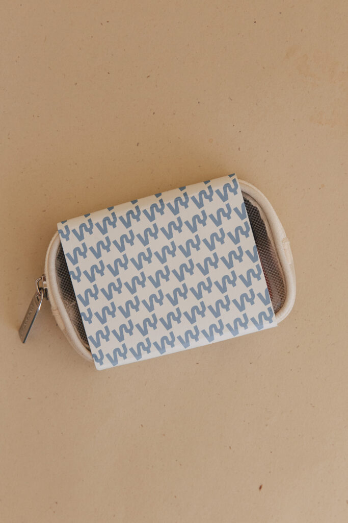
- Dynamic Backgrounds and Patterns – Gradients and repeating monograms in VYVE’s signature colors create cohesion and depth. Every brand element works together to convey motion, vitality, and unity. The result is a brand that feels bold, confident, and truly communal.
Stepping Up Their Brand Beyond the Logo
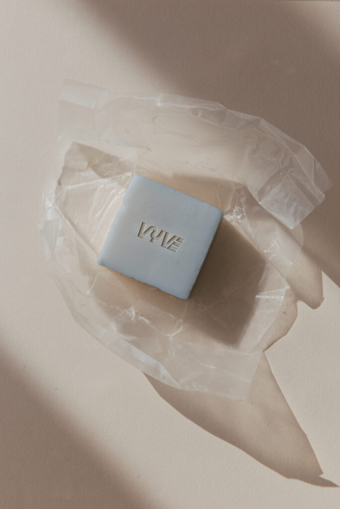
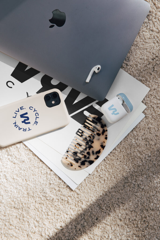
Custom branding is more than creating visuals. It is about building an experience that people remember and connect with. Once VYVE’s new identity was established, Michelle brought it to life in every part of her business.
- Brand photoshoots that highlight the studio’s signature colors.
- Interior design elements such as signage, wall colors, and branded details.
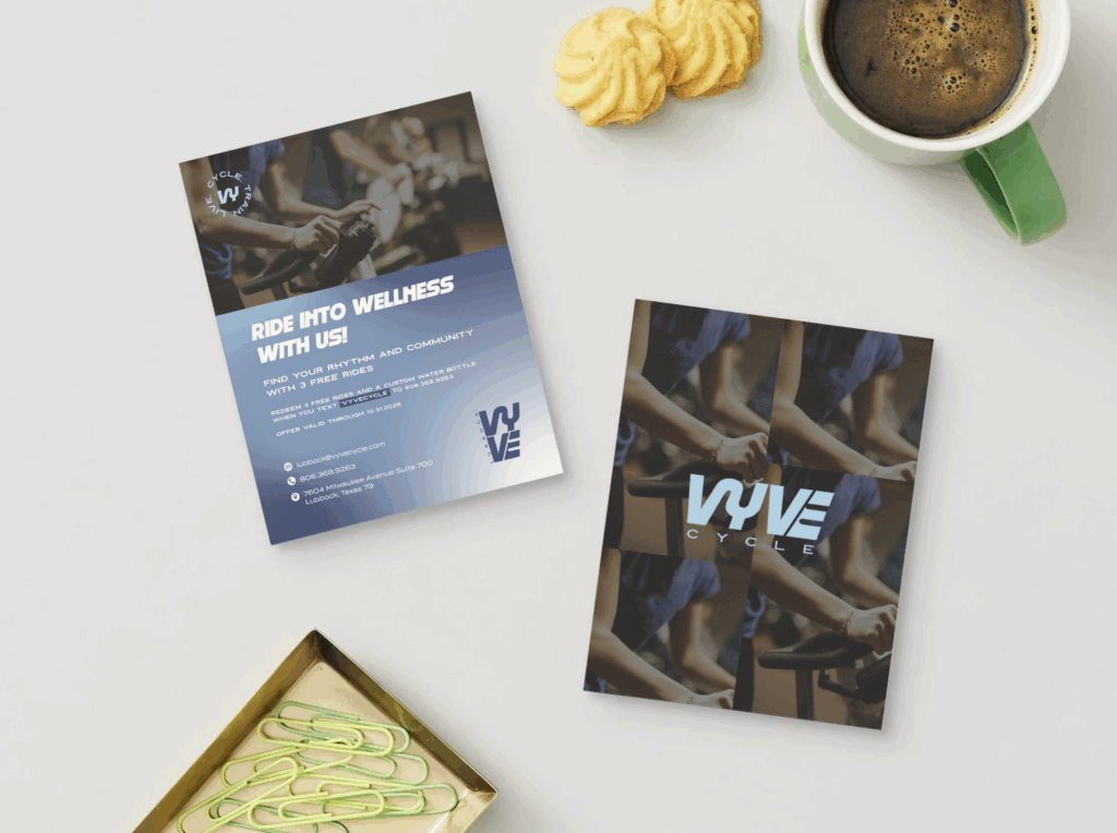
- Collaterals such as newsletter banners, flyers, social media graphics, and business cards.
- A consistent online presence that reflects the same energy and confidence.
Every detail reinforces VYVE’s identity, ensuring everyone who walks in or connects online feels the brand’s bold and empowering energy. This thoughtful approach to custom branding for a cycle studio extends beyond visuals into every customer touchpoint.
Moving Forward with Confidence
Creating a brand that aligns with your vision is one of the most powerful steps you can take as a business owner. When your brand reflects who you are and what you believe in, it naturally attracts the right audience and builds lasting connections. Every bold brand begins with a leap, just like VYVE. Explore our portfolio to see how we help visionary founders bring their stories to life through thoughtful, custom branding.


