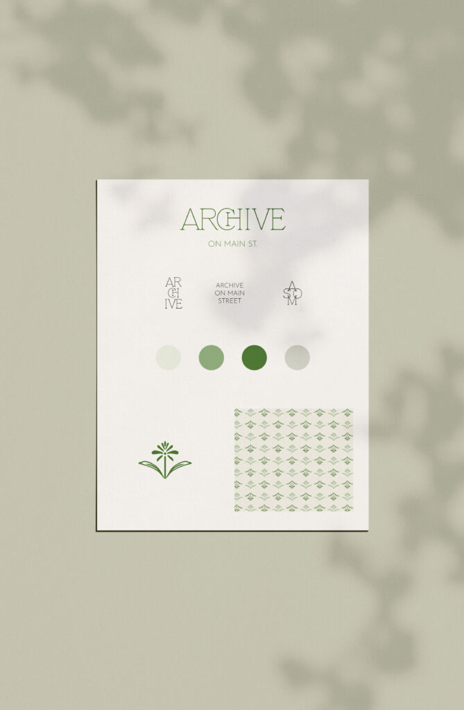
Julie Hamlin of Sacred Sage Photography is a well-known New Mexican photographer specializing in families, love stories, portraiture, babies, and branding. Julie worked hard for many years to grow her business and has even earned some prestigious awards along the way. But, it was time for a Sacred Sage Photography rebrand. Julie came to Saltd Studio with a branding vision that emanates “joy and genuine meets natural and organic meets high-end and professional.” Julie chose to use our Archive Semi-Custom Brand as a starting point. With the new creative direction in mind, I began sketching some ideas to bring her rebrand to life.
Where the Sacred Sage Photography rebrand began
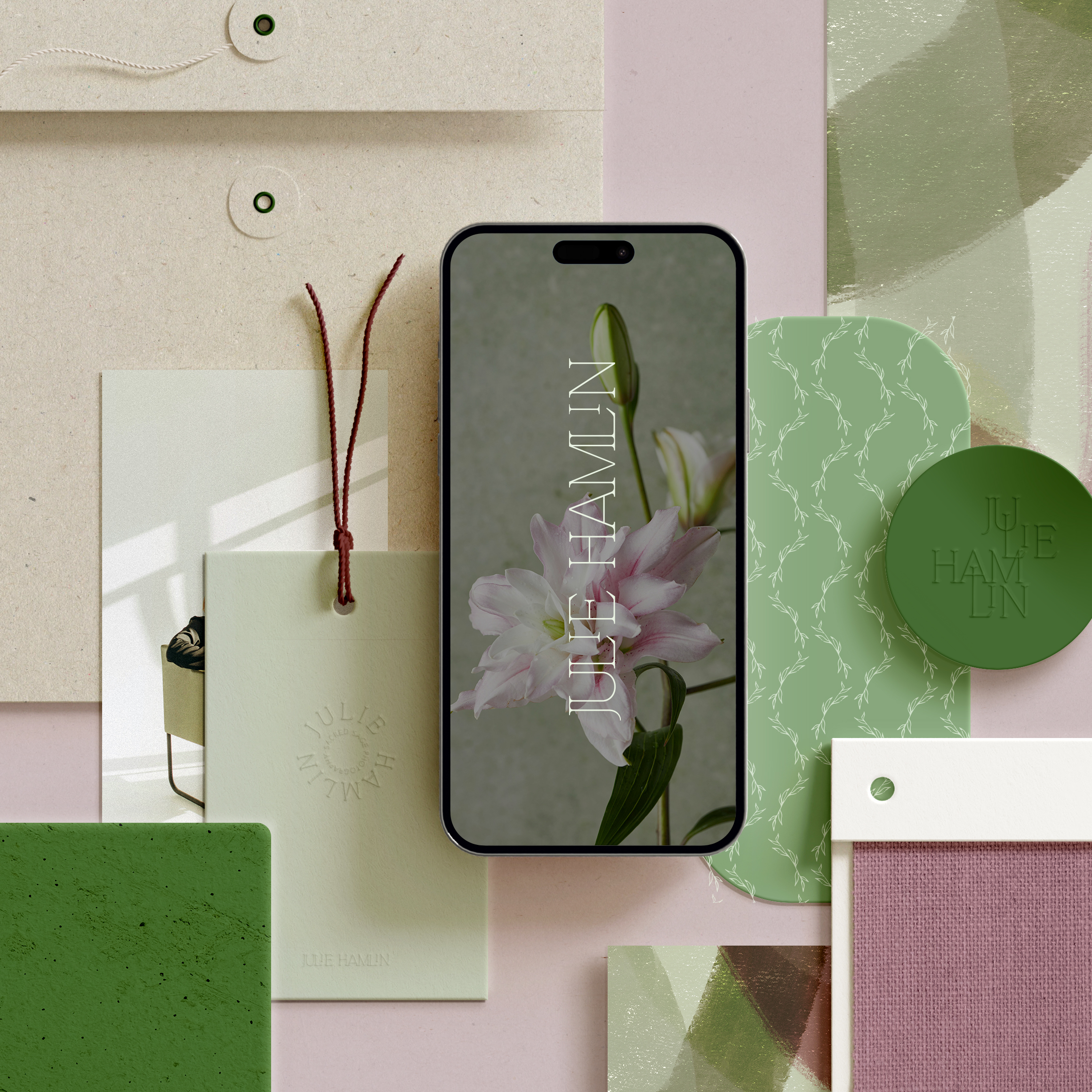
To kick the creative process off, we first landed on a green and mauve color palette. Julie also hoped for an icon to help individuals understand her business right off the bat, even if they had never heard of the business name. During Julie’s customization day, I created several illustration options before honing in on a lovely camera icon with leaves. Then, it was time to design a brand texture! I created some organic-feeling layers with a crafted vibe. Want to see a peek behind the process? Check out this video over on our Instagram here.
What the Archive Semi-Custom Brand began as:

How Julie’s Sacred Sage Photography rebrand turned out:


It was a complete joy working with Julie to make her vision a reality! We love the modern and organic feel of her rebrand, and we have had a blast cheering her on as she implements it on her website. If you are ready for a rebrand, let’s chat!
