
TLDR: Tranquil Gardens’ cannabis brand logo reflects a genetics-first philosophy through minimal, intentional design. Every element from their brand guide reinforces their focus on research, cultivation, and long-term brand clarity.
In a world of fast-paced businesses, Tranquil Gardens chooses to move with intention. That slower, more deliberate approach is rooted in their focus on genetics, where research, breeding, and refinement take time. Our role was to translate that core value into a cannabis brand logo and visual system that reflects the same level of precision and care. Rather than designing around what is current, we built the identity around their foundation in genetics and origin. Every element reflects clarity and restraint, resulting in a cannabis brand logo and identity that feels grounded, intentional, and built to evolve over time.
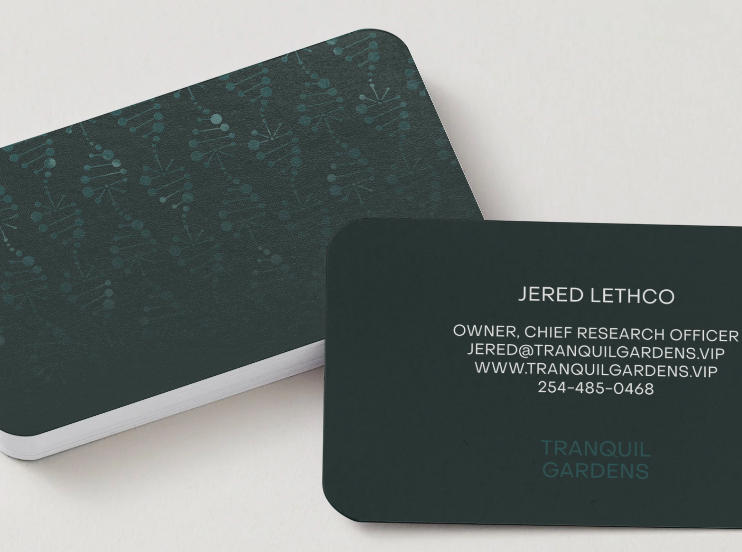
Designing a Cannabis Brand Logo Rooted in Origin
At the heart of Tranquil Gardens is a deep respect for origin. Here are the branding details we incorporated and what they represent:
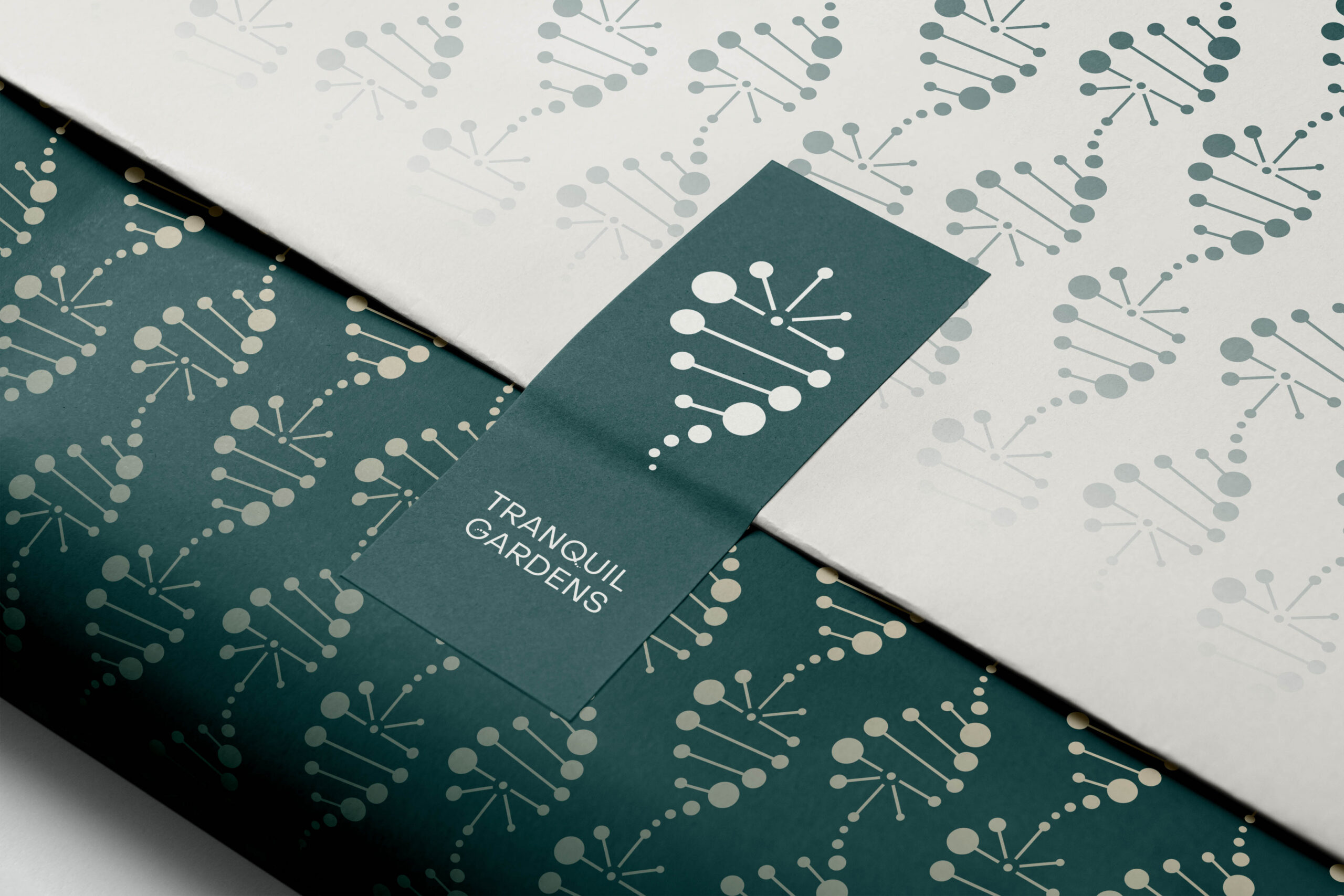
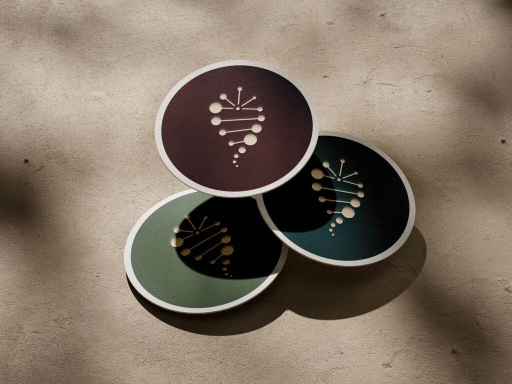
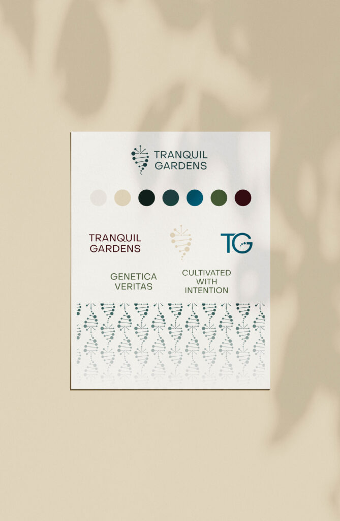
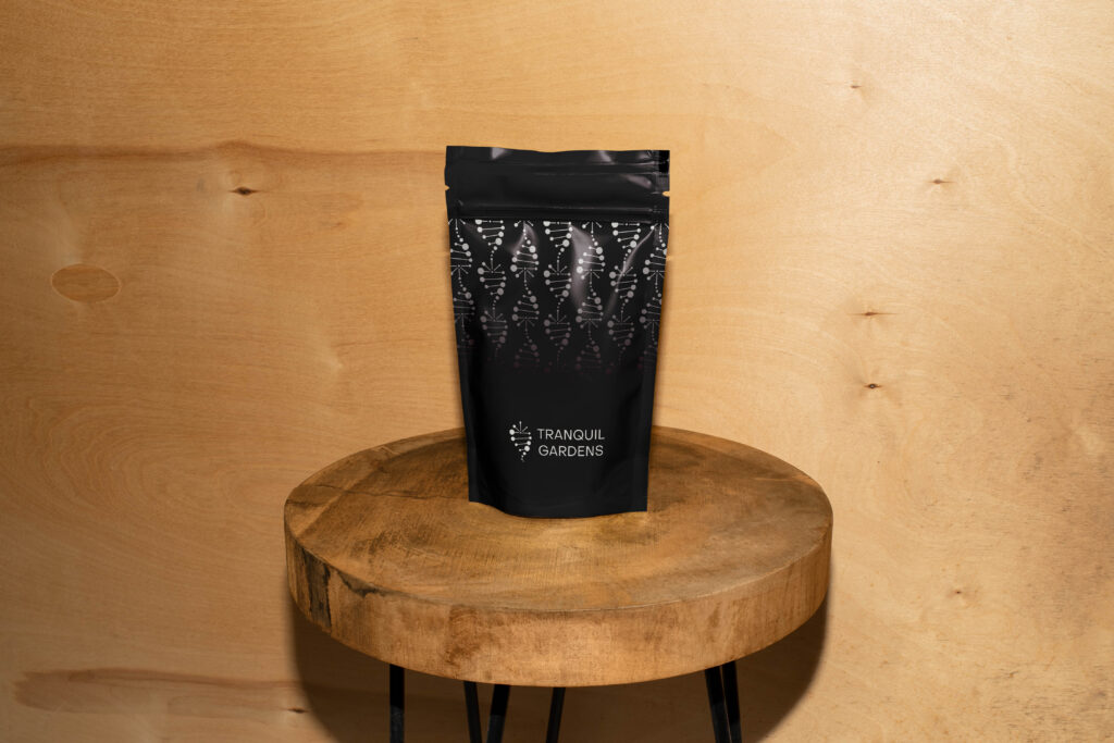
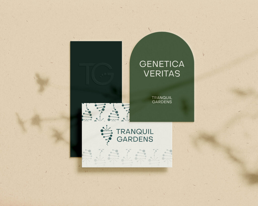
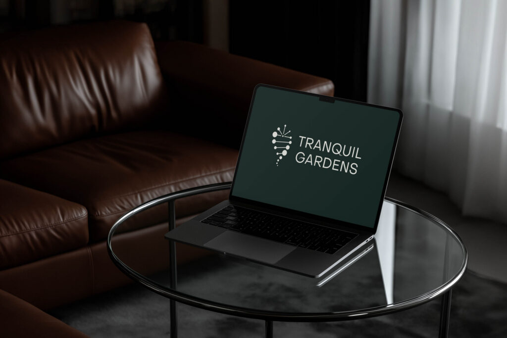
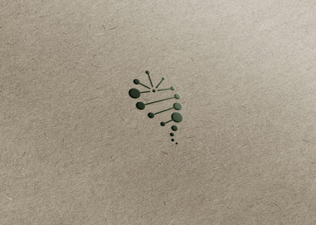
- DNA and cannabis leaf – This primary brand symbol communicates the brand’s genetics-first philosophy. It is refined and intentional, allowing the science to speak for itself. By transforming DNA into the leaf, the mark tells a story of origin, evolution, and outcome. Everything begins at the source, and the identity reflects that belief with clarity.
- Genetic dots – The logotype extends this narrative through subtle “genetic” dots woven into the lettering, echoing the structure of a DNA sequence. This detail reinforces the idea that precision and intention are embedded in every layer of the brand. The connection between symbol and typography is deliberate, suggesting that genetics are foundational, not decorative.
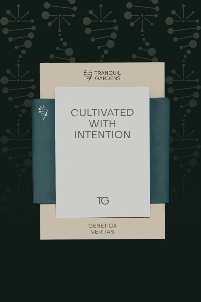
- Neutral color palette – The color palette balances depth with restraint. Neutral tones lead, grounding the brand in credibility and maturity, while moody teals and greens reflect botanical intelligence and cultivation. An accent of mulberry introduces a distinctive richness that adds dimension without overpowering the system.
- Gradient DNA pattern – The repeating DNA-based pattern represents ongoing research and refinement. It reflects continuity, iteration, and a long-term commitment to quality. Each repeated strand reinforces the idea that meaningful progress happens over time through discipline and expertise.
Together, these elements form a minimal and clean brand identity. It results in a cannabis brand logo and visual system that feels considered, distinctive, and built to last.
Intentional Branding That Works From Day One
Working with a brand designer who listens closely and translates your vision into a clear system removes much of the friction from the process. It ensures the work aligns with your business needs and communicates what you want your customers to understand.
If you are looking to build your branding, we are always open to conversations about how to create something that truly fits your brand.
Key Takeaways
- A strong cannabis brand logo starts with a clear philosophy, not just visuals
- Minimal design can communicate complex ideas when done intentionally
- Consistency across symbol, type, and color builds long-term recognition
- Thoughtful branding helps founders stay focused on what matters most
- Investing early in the right system creates clarity as the brand grows


